In this article, we will describe the 10 tips for designing an effective landing page. So, hold on to your socks as they are about to get knocked off.
For any business, a website acts like an online marketing campaign. It’s like a 24/7 billboard tasked to showcase the vision of your business and bring in visitors. By leaving a good first impression on your site visitors, you can encourage them to stay and do business with you. And the most important site page on which your visitors’ eyes will land first is the landing page. Therefore, in order to entice the visitors and push them down the conversion route you must optimise your landing page.
10 Tips for Designing an Effective Landing Page
1. Recommended Content Layout on the Landing Page
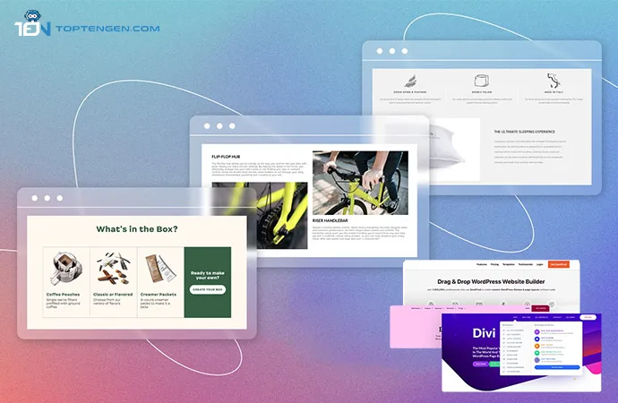
When creating content for your landing page keep in mind that it should be succinct as well as informative. A site visitor will take just 8 seconds to get a general idea of your website and make a decision regarding doing business with you. Now, as you are given only 8 seconds to represent your brand you have to be smart with the way you present your content. Be sure not to overload your landing page with information as it will overwhelm visitors. They won’t be able to find relevant information among the mounds of text and would opt for one of your competitors that aren’t bombarding users with blocks of text and pop-ups.
And let’s be real here nobody likes to read paragraph after paragraph of text when we are merely interested in buying something. Therefore, use informative, plain, and simple language to concisely tell your visitors about your brand and vision. Statistics show that landing pages harboring fewer than 100 words have a 50% chance of conversion than pages with more than 500. Another important aspect that will bring benefit to you is the use of headings. Break down your text by using catchy and alluring headings that compel visitors to read the rest of the paragraph.
The second element you need to include is the subheadings. While your headings will push your USP or Unique Selling Point, your subheadings will explain your brand further, showcasing a different angle to your USP. Make sure that your subheading compliments the heading but can also be understood on its own. Another point that you must keep in mind is to keep your tone of voice similar for headings, subheadings, benefits, and CTA.
2. Minimalistic and Aesthetic Design
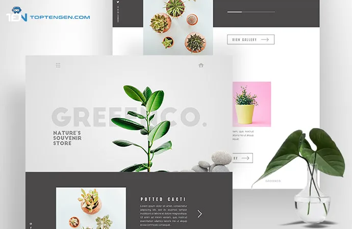
We are a generation that adores minimalism. Therefore, having a landing page that is not only minimalistic but also aesthetic will help attract tons of visitors. If you go on a full artsy and crafty mode with all the bells and whistles available to you in your website editor, you will leave your content redundant. Therefore, make sure to use simple and clean visual elements that are surrounded by a clean white visual space in order to draw the eyes of the visitors to the part that matters the most, your content. Moreover, a simple and minimalistic design will also decrease your website’s loading time. No one closes a website faster than a buffering frustrated visitor.
Also, make sure to opt for a bold and large font to make it easier for the visitors to read and understand your content despite the device they are using. Use blocky backgrounds on your landing page in order to separate different content stages, making the visitor feel like they are scrolling through a journey.
Wix and Squarespace Templates
If you are wondering where you can find the themes and templates that will not only increase the aesthetics of your website but will also make your content pop, then subscribe to either Wix, which houses an extensive content library, or Squarespace, that harbours the most modern and sleek templates.
3. Impactful and Awe-Inspiring Images
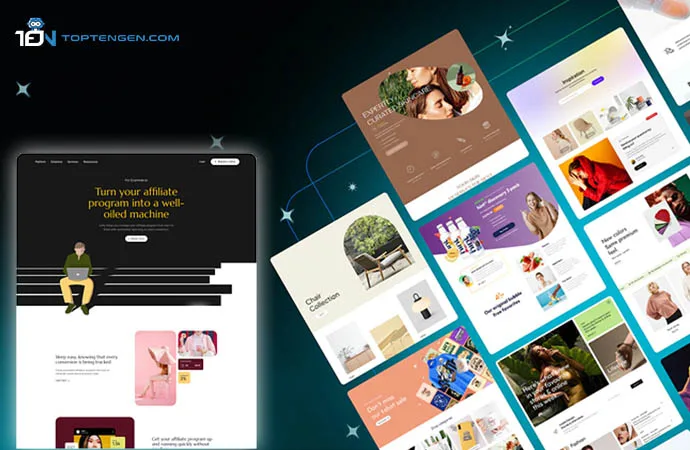
We all know that visual content is the key element of online marketing. The photos you use on your landing page have a pivotal impact on the way visitors engage with your products and services. Therefore, it is important to select images that clearly depict what you are offering. You can make use of a professional photographer or a graphic designer who will help create images that will not only make your website pop but will also help engage potential customers.
4. Build Trust, Build Conversion
The new visitors will probably land on your website via a search engine. Therefore, once they get to your site it is your duty to earn their trust by presenting a service that is trusted by others. To do that you can include client reviews and partner testimonials on your landing page, displaying social proof of collaboration and work. By using these trust signals you can put your visitors at ease and encourage them to do business with you.
5. A/B Testing
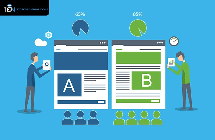
A/B testing is an important tool that allows you to see how visitors interact with your landing page and only a few website builders like HubSpot offer this feature. Once you have created your landing page, you can use A/B testing to generate analytics. These analytics will allow you to detect traffic, visitor interaction, and popular web pages, as well as see enable you to see how many users filled out your contact forms. You can also use the feature to see what kind of devices visitors are using, as it will help you in the long run.
6. Mobile-Responsive Lading Page

More than half of all web activity comes from mobile phones as 80% of the world population prefers to browse the internet via the handy device. Therefore, in this day and time if you don’t have a mobile-responsive website then your success rate is zero to none. To bring in more visitors your landing page needs to have an adaptable mobile design and should load quickly.
7. Get Social with Social Media Buttons
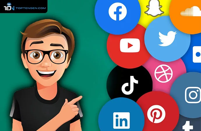
In order to push your social media profiles, either add clickable social buttons at the bottom of your page or incorporate them as floating elements. Either way don’t overwhelm the visitors by adding an abundance of social media buttons and keep them to a minimum. Only add the ones your target audience uses the most, in order to direct them to your profiles.
8. Embedding the Right Videos
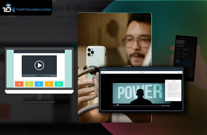
By embedding the right videos on your landing page, you can showcase your services, products, brand, and vision in a way text and image can’t. When designing a video, keep in mind the emotional cues visitors respond to. Studies show that awe-inspiring videos have a 25% chance of being clicked, funny videos have a 17% chance, joyful have a 14%, while angry videos only have a 6% chance of getting clicked. Just like other content, make sure to create videos that clearly but awe-inspiringly depict your vision.
9. Campaign-Specific Landing Pages
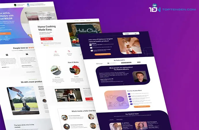
If your service is fractal, offering miscellaneous sub-services, and targeting different audiences, then it’s better to create separate landing pages for each service. Not only will this tactic keep content focused on individual landing pages but will also allow you to check which service is most engaged with and which one needs improvement. Make sure not to confuse the visitors and keep a uniform design across all the landing pages, ensuring them that all the services are being provided by the same parent company.
10. Limit Distractions and Eradicate Exit Opportunities
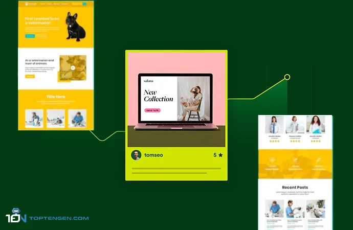
Remove exit opportunities if you wish to keep visitors on your landing page. You can do this by removing the navigation bar so as to keep the visitors scrolling. Make sure to stay away from internal and external links as your number one priority should be making sure the visitors focus solely on your landing page and contact form. The longer your visitors stay focused on your landing page, the better it is for your conversion rates.
The Bonus Tip
Introduce Your Team
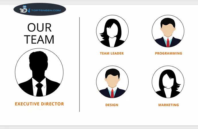
Not many businesses prefer to introduce their team on the landing pages. However, it is a good idea to reward those who work day and night for you and give them some recognition. Moreover, several studies show that visitors find webpages that introduce their team to be a lot more trustworthy than others, ultimately boosting conversions.
