Effective website navigation is an essential element of your site’s design. It helps users to swiftly locate their desired information and direct them towards your important pages. The primary objective of your website’s navigation is to enhance the user experience, extend the duration visitors engage with your website and improve the chances of taking meaningful actions. But how do you actually do it? You can do this by using these 10 Best Practices for Website Navigation. Let’s dive into it!
10 Best Practices for Website Navigation
You can follow these 10 Best Practices for Website Navigation:
1. Start With a Sitemap
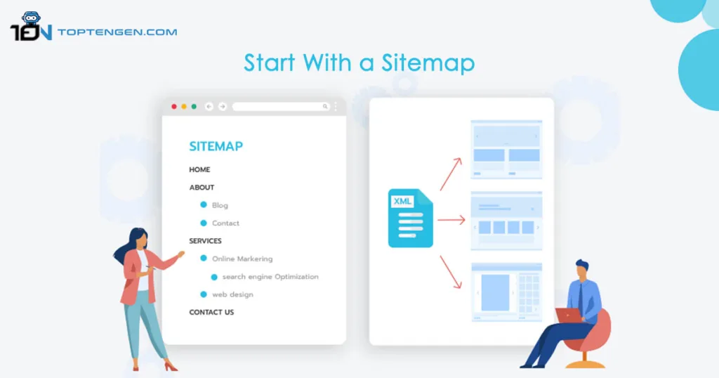
A sitemap is a comprehensive list of all your website’s pages. It is one of the 10 best practices for website navigation. It arranges these pages by starting with the main categories and themes and then detailing the pages under those core concepts. Utilize the sitemap to identify the key navigation items you should have in both your main menu and footer.
2. Prioritize Your Pages

When you’re figuring out how to arrange things, think about where you want to lead your visitors first. Your goals will depend on the type of website you’re making. But here are couple of suggestions to keep in mind.
- How will you lead visitors through the process?
- What information is important for you and your visitors?
- Why do people visit your website, and is it easy for them to achieve their goal using your navigation menu?
However, make sure the primary pages are in the main menu of your website. This way, they’ll be easily accessible to everyone who visits. Prioritize your pages is also one of the 10 best practices for website navigation.
3. Add a Search Bar
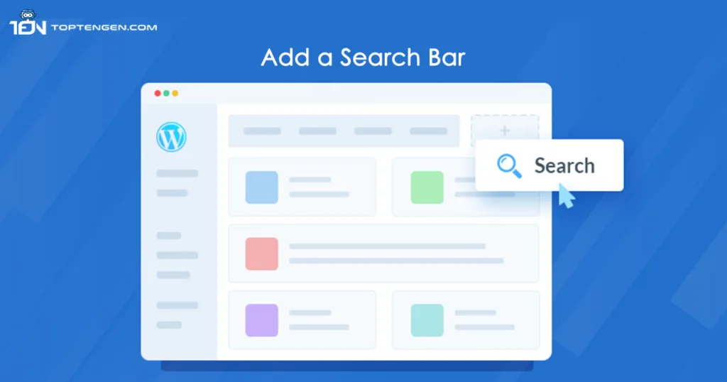
An effective strategy for enhancing navigation on a website with substantial content involves incorporating a personalized search bar. This feature is super handy for users, especially those with less experience surfing the web and stands among the 10 best practices for website navigation. When deciding where to put the search bar, it’s a good idea to keep it near the menu. Just like the menu that helps you move around, the search bar can stay fixed in a place as people scroll down the website. This makes it easy for everyone to get to different parts of the site without any trouble.
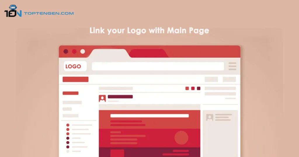
4. Link your Logo with Main Page
One common thing that many people expect when they visit a website is that if they click on a logo, it will take them back to the website’s main page. This is important because it is among the 10 best practices for website navigation and helps the users to go back to the main page and start exploring again. It works like a reset button. Normally a logo is placed on the top left of the webpage, and sometimes on websites with very long pages, you might also see a logo at the bottom of the page.
5. Use Different Designs for separate Platforms
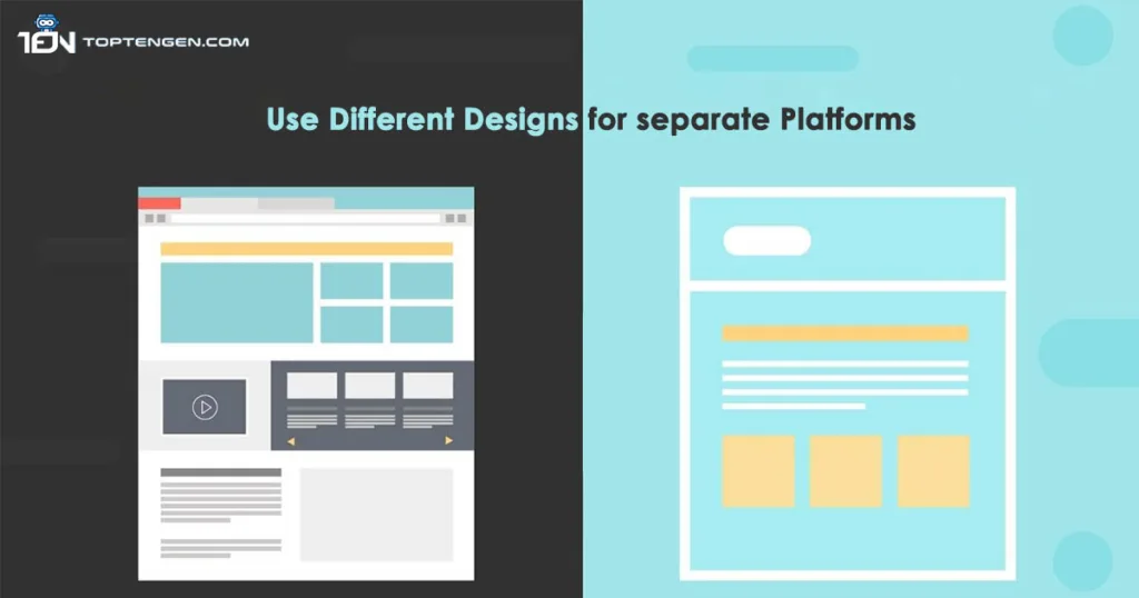
Navigation design is different for desktop and mobile platforms. On desktops, websites have more space, so text can be larger and clicked easily with a mouse. But on mobile devices, space is limited, so essential information needs to fit a small area. Because of this contrast, it’s good to create menu designs for each platform. It makes navigation better for different types of users. Moreover it is one of the 10 best practices for website navigation.
6. Avoid Hidden Menus
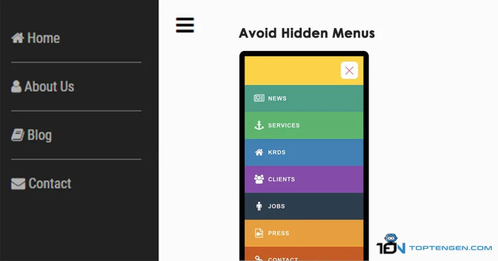
Hidden menus can make things tricky for both search engines and users. Search engines might face trouble figuring out what’s in these hidden menus, so the website might not appear as high in search results. And for users, hidden menus can be confusing and annoying. One common type is a drop-down menu, where you click, and more options appear. But sometimes, these options hide the things that you actually want to click. That’s why most people prefer websites with normal menus with clear links that lead to different pages and provide the most user-friendly experience and effortless navigation.
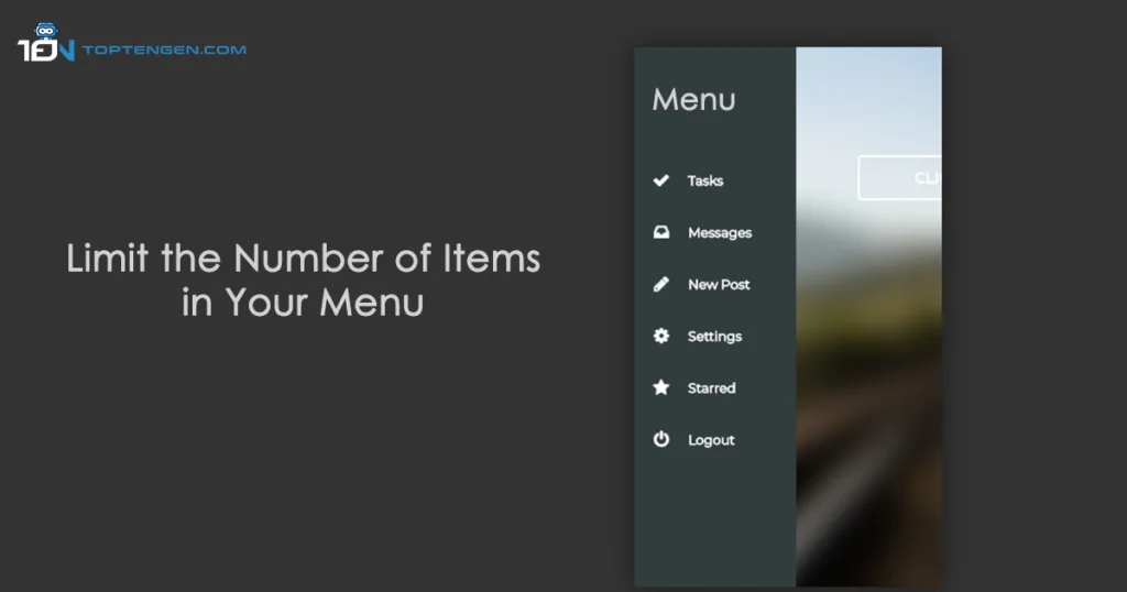
7. Limit the Number of Items in Your Menu
Try to make your menu simple with a maximum of six to seven categories. This helps users to quickly understand the categories and access their desired pages more efficiently. In this way, users can process the information easily and reach their desired pages. You can divide your website into sections with a drop-down menu if your website carries extensive information. When visitors hover over a menu item, a list of sub-categories will appear, it allows them to select from the various options. Limit the number of items in your menu is one of the popular top 10 best practices for website navigation.
8. Use Descriptive Labels
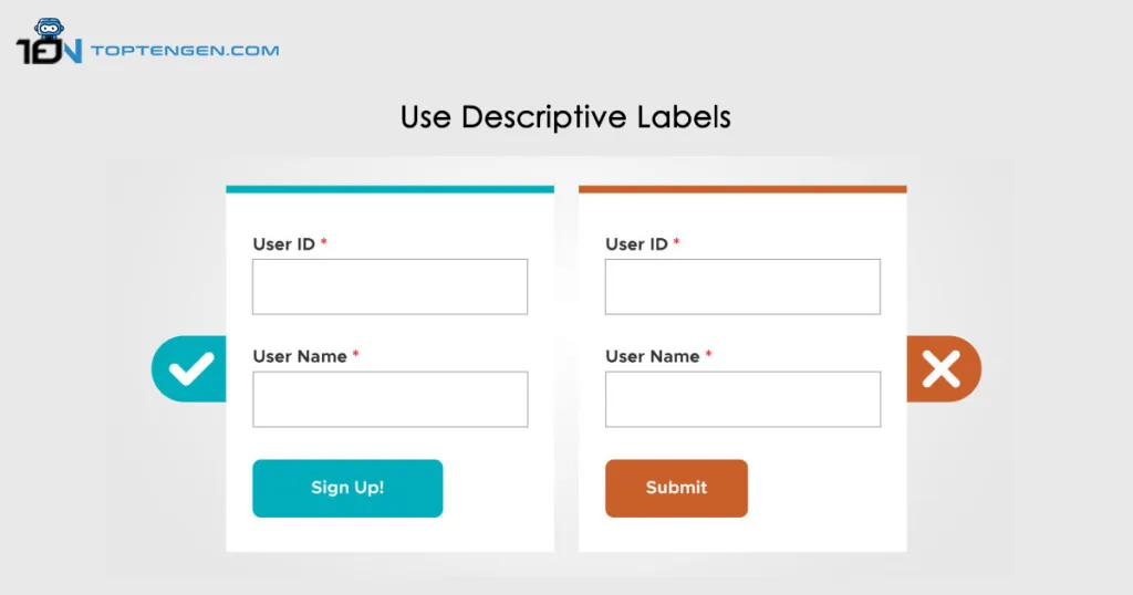
When you look at the navigation menu to click on, it should be easy to know what you’ll find when you click on each one. The best way to make this easy is to use clear labels for each option in the menu. Labels that are either too generic and or too creative are not informative; that’s why they don’t create a good user experience. Using descriptive labels is stands among the 10 best practices for website navigation and good for SEO if they incorporate relevant keywords. Search engines will index a website for any keyword that is used in the navigation.
9. Include Call to Actions
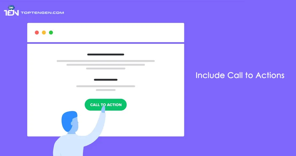
Incorporating “Contact Us”, “Book a Demo” or “Free Trial” CTAs within your navigation bar can greatly enhance its utility. But it’s crucial to be decisive about the CTA you include. If your primary goal is to engage directly with potential customers, then “Contact Us” would be the strongest option. Comparatively, more general CTAs like “Get Started” are less impactful due to their lack of specificity and guidance. Users might not understand the action of this one of the 10 best practices for website navigation and are less likely to follow it.
10. Add Navigation to the Footer
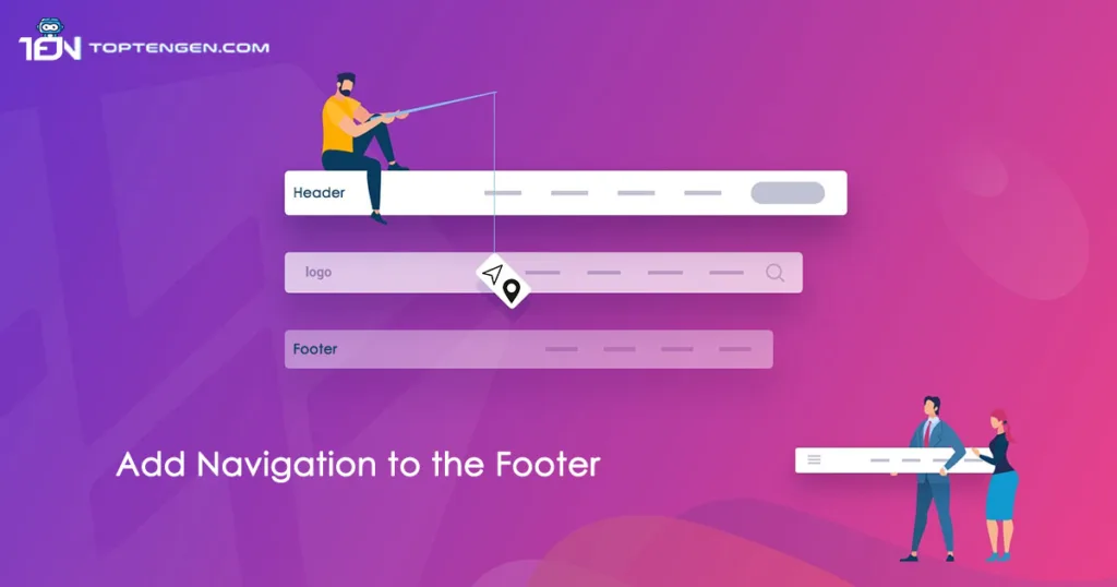
You can provide navigation options in the footer section at the bottom of your website pages. This includes all the main things of website and any other relevant pages. For instance, you can link to your social media pages, privacy policy and an additional CTA or contact us form. However, just like your main navigation, its important to keep the footer navigation simple and also it is among the top 10 best practices for website navigation.
Check out Top 10 Website Design Trends for creating a successful online presence!
Frequently Asked Questions
What is the difference between sitemap and site navigation?
What are the three main characteristics of good navigation?
· Visual elements
· Short and descriptive text
· Distinct web elements