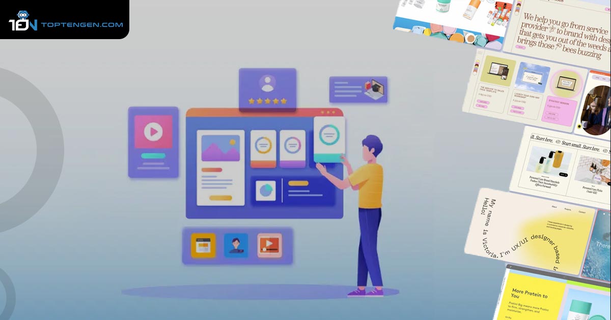
Website design is one of the important fundamentals of creating a successful online presence. It can affect how visitors perceive your brand, interact with your content, and convert into customers. Therefore, it is essential to keep up with the latest website design trends and apply them to your own website. In this article, I’ve listed the top 10 website design trends. Let’s have a look!
Top 10 Best Website Design Trends
Here are the top 10 best website design trends:
- Website load time and page speed
- 3D graphics and animations
- Parallax Scrolling
- Micro Interactions
- Neumorphism
- Minimalism
- Dark Mode
- Frosted Glass Effects
- White Space
- Virtual Reality
Overview – Top 10 Best Website Design Trends
Website Load Time and Page Speed

One of the most important factors in web design is website loading speed. Fast loading times have been essential for creating a positive user experience and improving search engine rankings for a long time. This continues to be a major focus for websites that want to achieve high rankings and successful conversions.
3D Graphics and Animations

Advancements in accessibility and affordability of three-dimensional elements have empowered designers and web agencies to create immersive experience for users. 3D graphics can be used for product showcase, animations, illustrations and more.
Parallax Scrolling

Parallax scrolling is another website design trend. It makes things on a website look like they’re moving in different ways. This makes the website interesting, getting user’s attention and making the story more engaging. However, you can use parallax scrolling on the website for backgrounds, pictures, texts, and other stuff.
Micro Interactions

Micro-interactions make a website more delightful. These are the animations or changes that happen on a website when a user interacts with it. They can improve the user experience or add some fun to the design. For example, when you hover over a button, it changes its colour or when you swipe the page it shows loading icons and many more.
Neumorphism

Neumorphism graphic design originates from merging web 2.0 skeuomorphism and flat design. Essentially, it presents a polished and subtle visual style that remains consistent across the design. This technique mainly uses shadows, and slight color variations, all within a monochromatic scheme. The main goal is to direct the users focus to essential content while reducing the risk of visual clutter or distractions.
Minimalism

The Future of successful website revolves around simplicity. A cluttered design not only makes it difficult to capture the audience attention but also has a negative impact on brand visibility. This is why the current trend leans towards vibrant minimalism. Whenever you create a website design, ensure that each page features a striking and colorful background. It enhances the visibility of every element for your audience.
Dark Mode

Dark mode is a design option that uses a dark background, light text and elements. It can create a contrast, reduce eye strain, and save battery life. Many websites and apps offer dark mode as a user preference or a toggle switch. Dard mode easily creates an ultra-modern look for your website.
Frosted Glass Effects

Modern developments in web technology have made it simple to incorporate the frosted glass effect into websites. This technique imparts a blurred aesthetic to elements situated beneath the frosted glass overlay and enhances the visual appeal of a section. Furthermore, it enables text or objects to be displayed on the top of the image while maintaining readability.
White Space

White space means giving your content some breathing room, instead of over-crowding the screen with too much information. This makes your website more pleasant for visitors, helps important content to stand out and makes it easier to read. The term white space might sound like it’s about color, but it’s not. It’s about the empty areas between elements on the screen.
Virtual Reality

In the upcoming years, websites will use virtual reality. Virtual reality can potentially serve valuable and meaningful content to website visitors and assist them in making informed purchasing decisions. It requires a high design and development, as well as advanced technologies and tools.
If you want to know the top 10 important tips to make your website mobile-friendly, click here!
Frequently Asked Questions
What are the benefits of using parallax scrolling on a website?
. Increase user engagement and retention by creating a memorable and immersive experience
· Improve SEO rankings by reducing the bounce rate
· Highlight your brand identity and personality by using techniques
· Showcase your products or services in a creative and attractive way


